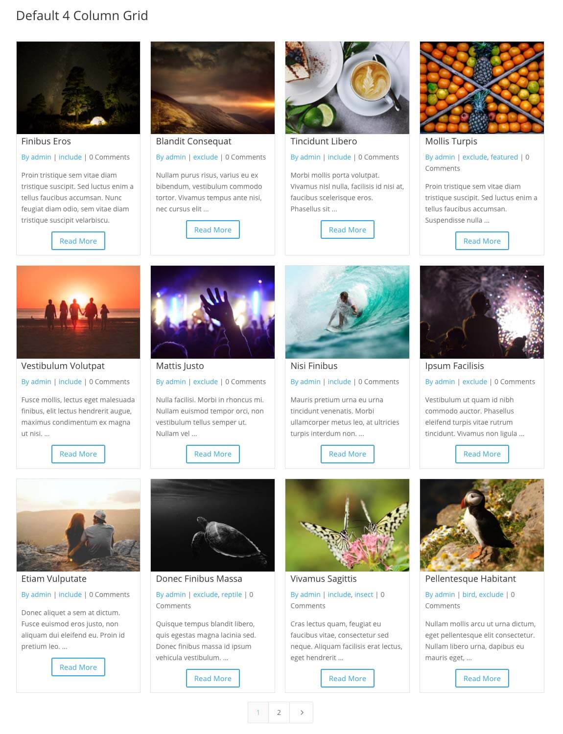
The Divi FilterGrid plugin creates a filterable grid of posts or any custom post type in a four-column layout using CSS Grid. You can easily change the number of columns within the Design tab of the module’s settings using a slider. For many users, a perfectly aligned grid of equal height and width posts is a beautiful site to behold. If you’re not one of those people, we’ll show you how you can add a little variety to your grid.
Before we begin, you may want to read our documentation on how CSS Grid is implemented in the Divi FilterGrid plugin. This is by no means a definitive guide on CSS Grid, but may help you understand how we’ll be modifying the grid layout in the tutorial below.
Default Four-column Grid
We use the following CSS in Divi FilterGrid to create a four-column grid:
.dp-dfg-layout-grid .dp-dfg-items {
    display: grid;
    grid-template-columns: repeat(auto-fill,minmax(20%,1fr));
}
But this could be simplified like this:
.dp-dfg-layout-grid .dp-dfg-items {
    display: grid;
    grid-template-columns: 1fr 1fr 1fr 1fr;
}
The results are exactly the same. We use the top CSS to make it easy to increase or decrease the number of columns in the module’s settings and see the results in the Visual Builder. But moving forward in this tutorial, we will refer to the bottom CSS because it will create the same four-column grid.
The fr represents a fraction of the available space in the grid container. In the CSS above, we are defining four columns in our grid, each with an equal fraction (equal width columns). We can add as many 1fr’s as we want to create additional columns. We can also change the 1 to any value we want to make some columns wider than others. We could also use percentage values instead of fractions.
For the examples below, we’ll create a 12-column layout. We could define this by adding twelve 1fr’s or we can use the repeat notation to shorthand this:
.dp-dfg-layout-grid .dp-dfg-items {
    display: grid;
    grid-template-columns: repeat(12,1fr) !important;
}
Here we are simply saying we want to create 1 column, repeated 12 times to create a 12-column grid. Notice we are applying this to the div container with class dp-dfg-items. This is the divi that will contain all of our grid items (posts) which have class dp-dfg-item. CSS Grid will automatically place each post into a column starting with the first column in the first row and working left to right and top to bottom. Once the first row is full, it will move to the first column of the 2nd row and repeat the process until all of the grid items are placed.
To change the layout in the example below, we are simply increasing the number of columns in the grid to give us more layout options and changing the number of columns certain posts span to create a staggered layout.
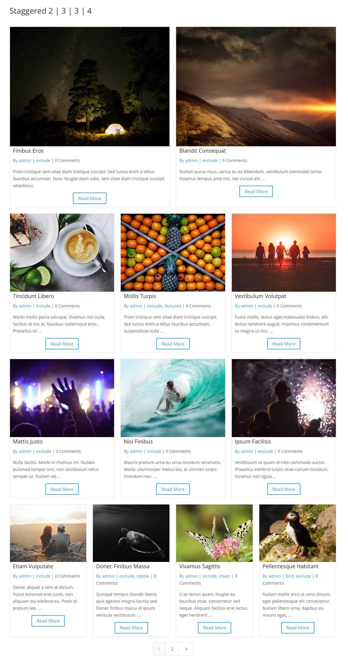
Staggered 2 – 3 – 3 – 4 Columns
Let’s start with the staggered layout above, prioritizing the top posts (presumably the most recent if your posts are displayed in the default descending order by date) and giving these posts more space. We could set the 1st row of the grid to display two posts (columns), the 2nd and 3rd row to display three posts in each row, and the remaining rows to display the default four posts.
The CSS in this example and the remaining examples should be added to your child theme’s stylesheet or the Divi -> Theme Options -> Custom CSS section.
We could do this by individually changing the number of columns each post spans like below:
@media only screen and ( min-width: 981px ) {
        /* CHANGE OUR DEFAULT FOUR COLUMN GRID TO 12 COLUMNS */
    .dp-dfg-layout-grid .dp-dfg-items {
        grid-template-columns: repeat(12, 1fr) !important;
    }

    /* FORCE THE FIRST TWO POSTS TO SPAN 6 COLUMNS EACH */
    .dp-dfg-layout-grid .dp-dfg-item:nth-child(1), .dp-dfg-layout-grid .dp-dfg-item:nth-child(2) {
	grid-column: span 6;
    }

    /* FORCE THE NEXT 6 POSTS TO SPAN 4 COLUMNS EACH */
    .dp-dfg-layout-grid .dp-dfg-item:nth-child(3), .dp-dfg-layout-grid .dp-dfg-item:nth-child(4), .dp-dfg-layout-grid .dp-dfg-item:nth-child(5), .dp-dfg-layout-grid .dp-dfg-item:nth-child(6), .dp-dfg-layout-grid .dp-dfg-item:nth-child(7), .dp-dfg-layout-grid .dp-dfg-item:nth-child(8)    {
	grid-column: span 4;
    }

    /* FORCE THE REMAINING POSTS TO SPAN 2 COLUMNS */
    .dp-dfg-layout-grid .dp-dfg-item {
	grid-column: auto / span 3;
    }
}
In the code above, we’re setting our grid to 12 columns and then changing the number of columns each post spans to create our 2 – 3 – 3 – 4 column layout. We’re also wrapping everything inside a media query. This will limit the layout to larger displays (981px or bigger) like desktop and laptop only. For smaller displays like tablets and phones, we’ll let the grid revert back to default values which are optimized for each screen size (3 columns for large tablets, 2 columns for small tablets, and 1 column for mobile). We can also shorthand the CSS above using :nth-child like this:
@media only screen and ( min-width: 981px ) {
    /* 2 | 3 | 3 | 4 FIRST PAGE ONLY */
    .dfg-2-3-3-4 .dp-dfg-layout-grid .dp-dfg-items {
	grid-template-columns: repeat(12, 1fr) !important;
    }

    .dfg-2-3-3-4 .dp-dfg-container[data-page="1"] .dp-dfg-item:nth-child(-n+8) {
	grid-column: span 4;
    }

    .dfg-2-3-3-4 .dp-dfg-container[data-page="1"] .dp-dfg-item:nth-child(-n+2) {
	grid-column: span 6;
    }

    .dfg-2-3-3-4 .dp-dfg-layout-grid .dp-dfg-item {
	grid-column: auto / span 3;
    }
}
There are a few other changes in the 2nd example that need to be explained. The dfg-2-3-3-4 is simply a class you can optionally add to the Divi FilterGrid module’s Advanced tab -> CSS ID & Classes -> CSS Class input. Then we can target that class like I did above so the staggered layout will only apply to Divi FilterGrid modules that have that class. If you wanted to apply the staggered layout to every Divi FilterGrid module on your site, you would remove the dfg-2-3-3-4 from the CSS above.
The other change is the addition of .dp-dfg-container[data-page=”1″]. Divi FilterGrid uses AJAX to get the next set of posts when the pagination is clicked. If we were on page two, the data-page value would change to 2. We can limit our staggered layout to only display if the user is on the first page of results by adding the data attribute selector above with a value of 1. On page two or later, the default four-column layout would be displayed. You can remove this from the CSS if you want the same layout for every page.
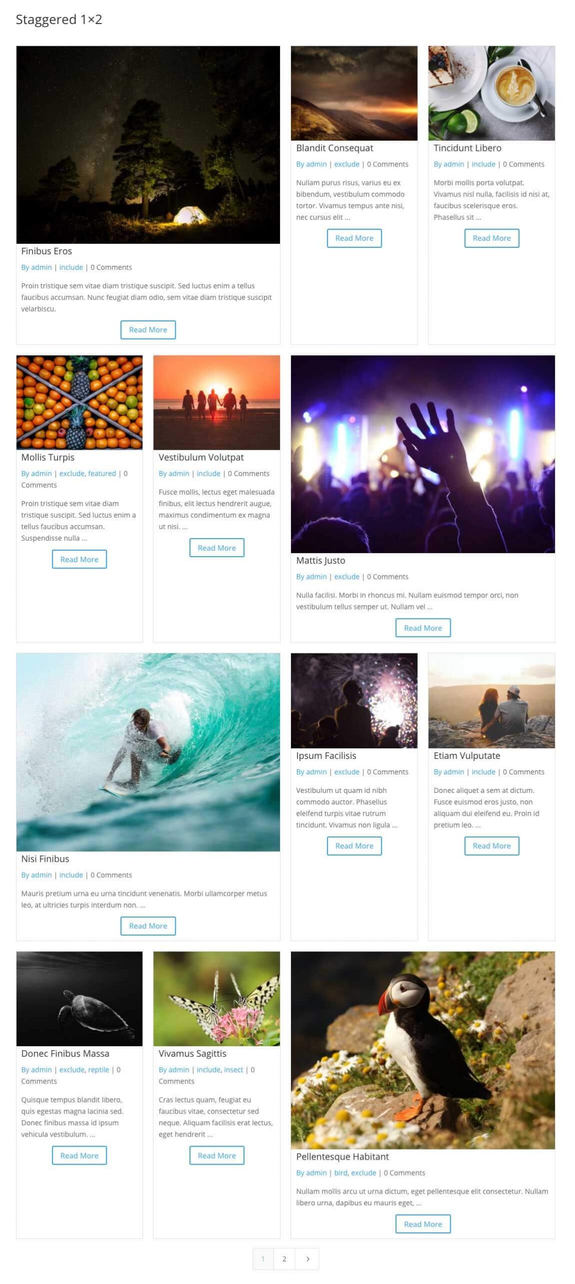
Staggered 1×2 Columns
The next staggered layout we’ll create is a 1 x 2 column and a 2 x 1 column that then repeats. Since this layout is simply to break up the layout and is not for prioritizing the most recent posts, we don’t need to limit this layout to the first page. But we will limit it to screen sizes 981px or greater like before:
@media only screen and ( min-width: 981px ) {
    /* ALTERNATING 1X2 | 2X1 ALL PAGES */
    .dfg-1x2 .dp-dfg-layout-grid .dp-dfg-items {
	grid-template-columns: repeat(12, 1fr) !important;
    }

    .dfg-1x2 .dp-dfg-layout-grid .dp-dfg-item {
	grid-column: auto / span 3;
    }

    .dfg-1x2 .dp-dfg-item:nth-child(6n+1) {
	grid-column: span 6;
    }

    .dfg-1x2 .dp-dfg-item:nth-child(6n+6) {
	grid-column: span 6;
    }
}
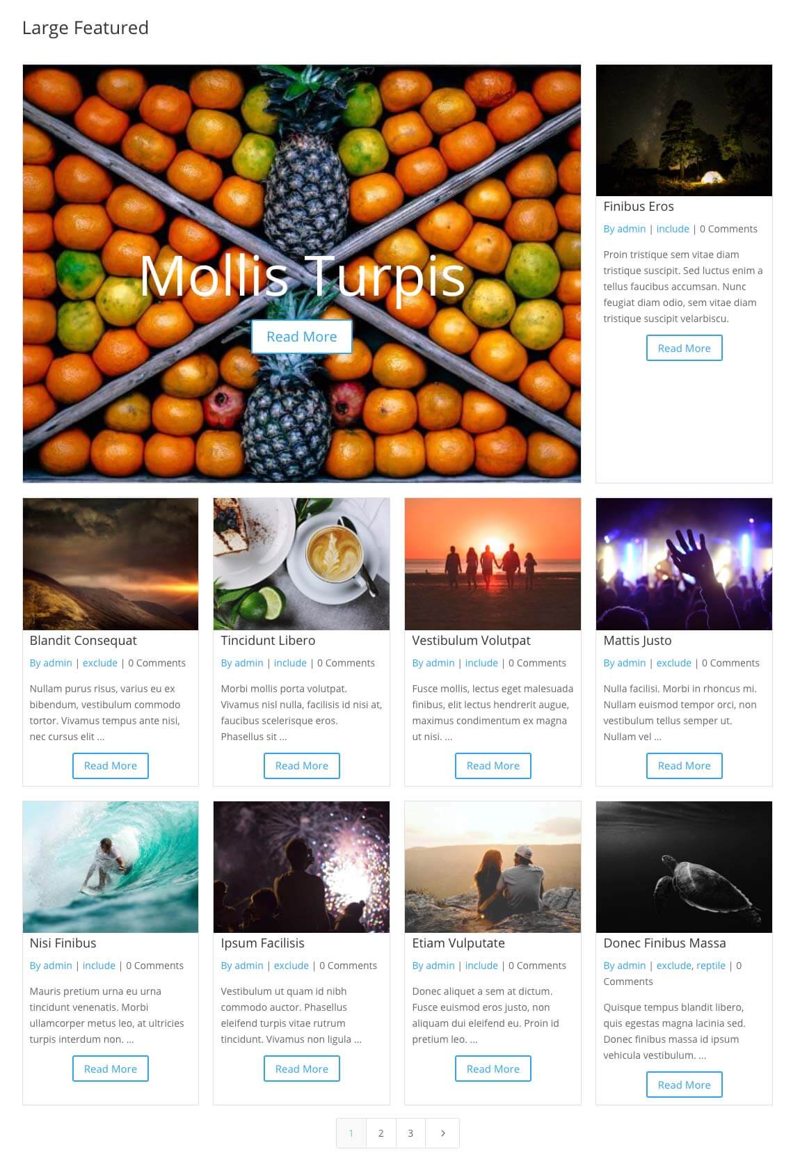
Large Featured
The last example is a little more involved than the other two. In this layout, we will target a post that has a specific class “tag-featured”. Each post in the grid will have multiple classes that correspond to the terms assigned to that post. In this example, I have tagged a post with the “featured” term. I can then target this post using CSS to move it wherever I want in the grid.
In my example, the post with the “tag-featured” class is the fourth post in the grid. But I want to move it to the top of the grid and prioritize it by having it span three-fourths of the columns in the first row. The remaining posts will get auto placed in the grid:
@media only screen and ( min-width: 981px ) {
    /* CENTERED FEATURED POST */
    .dfg-large-featured .dp-dfg-layout-grid .dp-dfg-items {
	grid-template-columns: repeat(12, 1fr) !important;
    }

    .dfg-large-featured .dp-dfg-layout-grid .dp-dfg-item {
	grid-column: auto / span 3;
    }

    /* MOVE THE FEATURED POST TO THE FIRST 9 COLUMNS OF ROW 1 */
    .dfg-large-featured .dp-dfg-item.tag-featured {
	grid-column: 1/10;
	grid-row: 1;
    }

    /* HIDE ALL ELEMENT IN THE GRID EXCEPT THE IMAGE CONTAINER */
    .dfg-large-featured .dp-dfg-item.tag-featured > *:not(.dp-dfg-image) {
	display: none;
    }

    /* UNHIDE THE POST TITLE CONTAINER, MOVE IT TO THE SAME ROW AS THE IMAGE, CENTER IT'S CONTENT */
    .dfg-large-featured .dp-dfg-item.tag-featured .dp-dfg-header {
	display: flex !important;
	grid-row: 1;
	grid-column: 1;
	align-items: center;
	justify-content: center;
    }

    /* CHANGE THE COLOR AND ENLARGE THE TITLE */
    .dfg-large-featured .dp-dfg-item.tag-featured .dp-dfg-header h2 {
	color: #fff;
	font-size: 8em;
    }

    /* UNHIDE AND ABSOLUTE POSITION THE READ MORE BUTTON CONTAINER JUST BELOW THE TITLE */
    .dfg-large-featured .dp-dfg-item.tag-featured .et_pb_button_wrapper {
	display: block !important;
	position: absolute;
	top: 60%;
	left: 0;
	width: 100%;
    }

    /* ENLARGE THE FONT OF THE READ MORE BUTTON */
    .dfg-large-featured .dp-dfg-item.tag-featured .dp-dfg-more-button {
	font-size: 2em !important;
    }
}
There’s a lot happening in the CSS above. I am manually placing the post with class “term-featured” in the first row and defining the columns it should be placed in. Since I want the post in the top left corner of the grid, I can’t simply have it span 9 columns. I have to define the columns I want it to span using 1/10. This tells the browser to start the post in the first column and end it at the beginning of the 10th column. The next post will then get auto placed in columns 10, 11, and 12 of the first row. And the remaining posts will get auto placed in the remaining rows, each spanning 3 columns.
The remaining CSS adjust the layout of the content inside the featured post. In Divi FilterGrid, we use CSS Grid to create the four-column grid of posts. We also use CSS Grid to arrange the elements (thumbnail, title, meta, etc.) within each post. In the CSS above, I am hiding all of these elements except the thumbnail. This is easier than individually hiding each element.
I then move the title container to the first row and column of the post grid. This is the same row and column as the image. Since the title comes after the image in the HTML, it has a higher z-index value and sits “on top of” the image. I then use flexbox to center the content inside the title container. This will center the title on the image. Lastly, I absolute position the button just below the title.
With the assumption that I’ll only have one post with the featured tag, I do not need to use the .dp-dfg-container[data-page=”1″] selector to limit it to the first page. You could also modify this example to apply to the first post in the grid by changing the .dfg-large-featured .dp-dfg-item.tag-featured selector to .dfg-large-featured .dp-dfg-item:nth-child(1).
* In this example, I also changed the Posts Number value from the default 12 to 10 in the module’s Query Options section to maintain a full row in the last row of the grid.



Thank you! You must have been reading my mind as I was just looking for this doing a re-design of a site (ditching DIVI Extra for DIVI + Filtergrid – so much better!)
Great! Glad to hear this post was helpful Kim 🙂
Hi Brad, thank you for this very nice post. When you have time, please extend it how to add custom css, to change the background of the pages numbers, or the background of the posts, by overwintering the defaults options etcc..
Thanks Erion! I’ll add it to the list!