CSS Grid
This document explains how CSS Grid is used in the Divi FilterGrid plugin.
CSS Grid is an exciting and relatively new option for creating webpage layouts. Instead of floating items from left to right like traditional layouts, CSS Grid places elements within columns and rows much like a grid or HTML table. One of the advantages here is having more granular control of where items are placed on the page. Another advantage of CSS Grid is having the ability to structure your HTML logically, but with the ability to move elements around in a way that makes sense visually. This will be the focus of this document as it relates to the Divi FilterGrid plugin.
* It’s important to note the examples below will apply to modules that have the Grid layout and Default skin applied in the Design tab settings, both of which are the default options. The Divi FilterGrid plugin is also capable of creating a completely blank canvas for you to work with by selecting None for both the layout and skin options. This will remove nearly all CSS and allow you to apply your own without having to overwrite any default CSS rules.
** CSS Grid has been around for many years and is supported by all of the latest web browsers. It is supported in Microsoft’s Edge browser, but NOT Internet Explorer. To account for this, we have implemented a flexbox fallback for any browser that does not support CSS Grid. The Flexbox layout is identical to the CSS Grid layout, displaying the posts in a four column grid with filters at the top and pagination at the bottom.
Multiple CSS Grids
CSS Grid allows users to create grids within grids. We utilize this feature in the layouts created by the Divi FilterGrid plugin within which three grids are created.
Container grid (.dp-dfg-container) – used to arrange the filters, posts, and pagination in relation to each other.
Items grid (.dp-dfg-items) – used to arrange the posts or custom post types.
Item grid (.dp-dfg-item) – used to arrange the elements within each post item such as the image and title.
The Container Grid
The container grid is the outermost grid and the most simple to create. The default layout and skin display the filters, post items and pagination stacked vertically and fullwidth. This is easy to accomplish with CSS Grid:
.dp-dfg-container {
    font-size: 10px;
    display: grid;
    grid-gap: 2em;
    grid-column-gap: 2em;
    grid-row-gap: 2em;
}
This is all that’s needed to tell the browser we want the items to be placed in a very basic grid. Each element within the dp-dfg-container will automatically get placed into a single-column grid and in it’s own row like this:
- Filters Container – column one / row one
- Items Container – column one / row two
- Pagination Container – column one / row three
Grid Font Size, Column Gap, and Row Gap
The font size of 10px is used to establish a baseline value for the row and column gaps. The grid-gap rule is a shorthand combination of grid-column-gap and grid-row-gap and applies to the space between the columns and the rows. This is not fully supported in olders browsers so we also include the individual rules for column gap and row gap. Since the font size is 10px and the column and row gap are set to 2em, the gap between each column and row is 20px. These values can be changed in the module’s Design Tab.
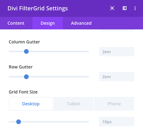
Divi FilterGrid Grid Gap & Font
Again, the Grid Font Size is used as a baseline for the gap size between columns and rows. For example, if the font size was increased from the default 10px to 12px, the column and row gap would increase from the default 20px to 24px. You can also see the column and row gaps can be adjusted independently.
The Grid Font Size isn’t just a baseline for the column and row gaps. Nearly every CSS value that modifies the size and spacing of an element in Divi FilterGrid is based on the Grid Font Size. For example, all default font size, line height, padding and margin values are in em instead of px. Increasing the Grid Font Size will increase all of these values at once. You also have the option to adjust each value individually.
Rearranging the Grid
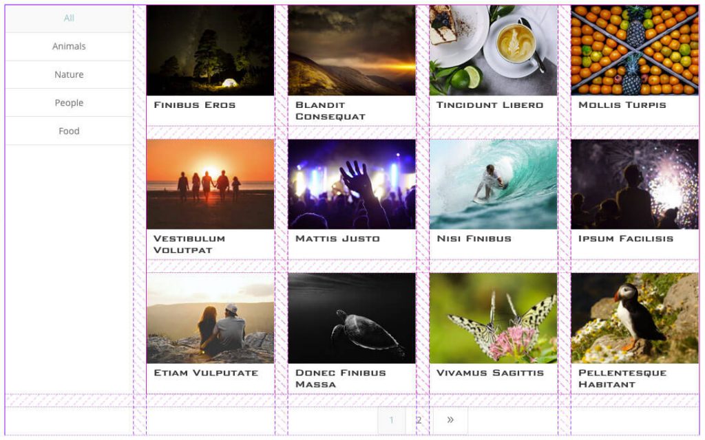
Left Vertical Filters
We can easily rearrange the container grid with a few simple CSS changes. For example, the Left Vertical Filters skin as show above will move the filters and grid items to the same row with five columns and the pagination to a second row but restricted and centered to the last four columns under the grid items. The following CSS is all that’s required:
// CREATE FIVE COLUMNS
.dp-dfg-skin-default.dp-dfg-skin-left-vertical-filters {
    grid-template-columns: 1fr 1fr 1fr 1fr 1fr;
}

// PLACE THE FILTERS IN THE FIRST ROW AND COLUMN ONE
.dp-dfg-skin-default.dp-dfg-skin-left-vertical-filters .dp-dfg-filters {
    grid-row: 1;
    grid-column: 1;
}

// PLACE THE GRID ITEMS IN COLUMNS TWO THROUGH FIVE
.dp-dfg-skin-default.dp-dfg-skin-left-vertical-filters .dp-dfg-items {
    grid-row: 1;
    grid-column: 2/6;
    position: relative;
}

//PLACE THE PAGINATION IN COLUMNS TWO THROUGH FIVE
.dp-dfg-skin-default.dp-dfg-skin-left-vertical-filters .dp-dfg-pagination {
    grid-column: 2/6;
}
Since there are five columns, each column consumes 20% of the available space. This gives the left filters 20% and the grid items 80%. By default, CSS Grid will auto place items in the first available row and column. Since we have defined a grid with five columns, the CSS applied to the filters is redundant and not necessary. The grid items container and pagination need to be defined however, otherwise the grid items would get placed in column two and the pagination would get placed in column three.
Now Let’s look at how we can easily modify this layout. If we wanted to increase the width of the filters, we could expand it to two columns or 40%. We would then need to limit the grid items and pagination to three columns or 60% since we lost a column.
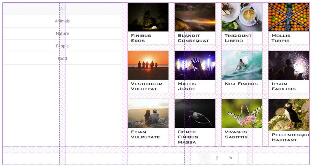
Left Filters In Two Columns
Here’s how the final CSS would look:
// CREATE FIVE COLUMNS
.dp-dfg-skin-default.dp-dfg-skin-left-vertical-filters {
    grid-template-columns: 1fr 1fr 1fr 1fr 1fr;
}

// PLACE THE FILTERS IN THE FIRST ROW AND COLUMNS ONE THROUGH TWO
.dp-dfg-skin-default.dp-dfg-skin-left-vertical-filters .dp-dfg-filters {
    grid-row: 1;
    grid-column: 1/3;
}

// PLACE THE GRID ITEMS IN THE FIRST ROW AND COLUMNS THREE THROUGH FIVE
.dp-dfg-skin-default.dp-dfg-skin-left-vertical-filters .dp-dfg-items {
    grid-row: 1;
    grid-column: 3/6;
    position: relative;
}

//PLACE THE PAGINATION IN COLUMNS THREE THROUGH FIVE
.dp-dfg-skin-default.dp-dfg-skin-left-vertical-filters .dp-dfg-pagination {
    grid-column: 3/6;
}
If we wanted to have more granular control over the percentages, we could increase the total number of columns in the grid. We could also simply use percentage values for the columns:
.dp-dfg-layout-list .dp-dfg-item {
    grid-template-columns: 10% 1fr;
}
The CSS above defines the width of the filters at 10% of the total available space. The second column containing the grid items container and pagination would then consume the remaining 90% of the space.
The Items Grid
Now let’s look at the items grid which consists of the posts or custom post type you have chosen to display.
By default, the posts are arranged in a four column layout. This could easily be defined with the following CSS:
.dp-dfg-layout-grid .dp-dfg-items {
    display: grid;
    grid-template-columns: 1fr 1fr 1fr 1fr;
}
This would create four columns of equal width in the grid. However, in order for us to make it easy to change the number of columns in the grid from the module’s Design tab, we had to use a more complicated statement:
.dp-dfg-layout-grid .dp-dfg-items {
    display: grid;
    grid-template-columns: repeat(auto-fill,minmax(20%,1fr));
}
Here we are saying the grid should consists of as many 20% wide columns as will fit with the remaining space shared equally between the columns. Since our column gutters are set to 2em (20px) by default, we need to remove that space from the available space. 20% is a safe number that will give us four columns. If we wanted three columns, we would increase the 20% value to 24%. This can easily be done using a slider in the module’s Design tab as shown below.
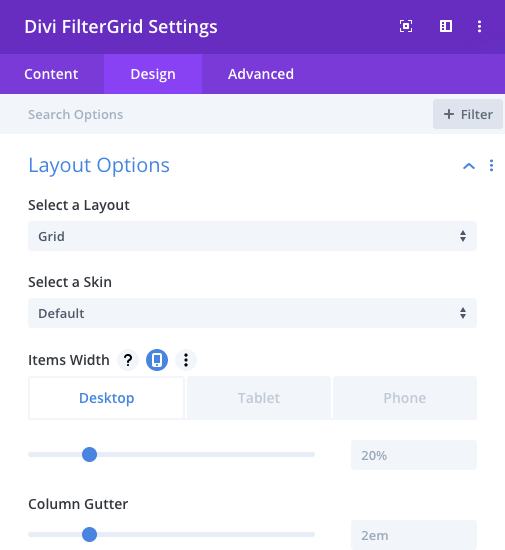
Items Width Slider
Since we can view the outcome of changing the Items Width default 20% value in the Visual Builder, changing the number of columns in the Divi FilterGrid plugin is as easy as clicking and sliding. To create more columns, simply decrease the Items Width value. To reduce the number of columns, simply increase the Items Width value. Remember the Column Gutter value will affect the outcome. It would be best to decide on this value first.
The Item Grid
Now let’s look at the item grid which consists of the post elements within each grid item: image, overlay, title, meta, excerpt, read more button, and custom fields/content.. This is likely where you’ll want to make your changes and where CSS Grid starts to get exciting!
By default, each element in this grid is placed in a new row in the order it appears and in a single column. If you have the Default skin selected, the CSS looks like this:
.dp-dfg-layout-grid .dp-dfg-item{
    display: grid;
    grid-auto-rows: min-content;
}
.dp-dfg-layout-grid .dp-dfg-image {
    grid-column: 1;
    grid-row: 1;
}
.dp-dfg-layout-grid .dp-dfg-overlay{
    grid-column: 1;
    grid-row: 1;
}
In the CSS above we are saying each element should be auto placed in a new row no taller than is need to contain that element. We are then hardcoding the position of the image and overlay so the two share the same row. Since the overlay comes after the images in the HTML, it has a higher z-index than the image and so it sits “on top of” the image.
Now let’s say we want our title above the featured image. No problem. The following CSS will rearrange the items so the title is placed in the first row, the image and overlay in the second row, and the remaining elements in newly, auto-created rows below the image and overlay:
.dp-dfg-layout-grid.dp-dfg-skin-default .dp-dfg-image, .dp-dfg-layout-grid.dp-dfg-skin-default .dp-dfg-overlay {
    grid-row: 2;
}

.dp-dfg-layout-grid.dp-dfg-skin-default .dp-dfg-header {
    grid-row: 1;
}
That’s it! No absolute positioning or negative margins! We simply tell the browser to place the image and overlay in the second row and the title in the first row. All other elements will automatically get added to new rows.
Let’s look at another example. Custom fields and custom content are added to the bottom of the item grid by default. Using CSS Grid, we can easily reposition this custom content wherever we want!
In the example below, assume we have turned off the featured image in the module settings. We can then replace it with any image we want from a custom field or anywhere from the post object and output it into the custom content container. Then we can move the new image to the same row as the original image:
.dp-dfg-layout-grid.dp-dfg-skin-default .dp-dfg-custom-content {
    grid-column: 1;
    grid-row: 1;
    margin: 0 -1em;
}
Voila! No need to use complex CSS or javascript methods to move the image to the exact location you need it. CSS Grid makes this very easy to do.
CSS Grid Resources
As with any new tool, CSS Grid can be a little difficult to grasp at first and especially since it is so different from what we have used for so long. The examples above barely scratch the surface of what is possible. For more information about CSS Grid, I would highly recommend this course on Lynda.com.
There are also several free resources available but not nearly as in-depth or well-organized as the course above. Smashing Magazine has a really good intro into CSS Grid.
Mozilla has excellent documentation on CSS Grid and all of the available properties with lots of examples. If you’re looking to understand more about a specific property such as grid-template-columns, this is a great resource.
